LOOKING FOR INTERNS!
February 10, 2012 § 1 Comment
74STUDIO is looking for interns!
’74Studio is a Creative Studio and Agency located in the oldest district of Istanbul-Karakoy specializing in Graphic Design and Brand Making. With a team of multi-disciplinary designers, we bring to life well thought out designs and craft a powerful body of work for a client, list of individuals, brands and institutions. We value immaculate and meticulous designs and believe that visual communication using different mediums exceeds expectations both aesthetically and strategically. 74studio also provides the grounds for expression of independent ideas and artistic visions, using it as a platform for collaboration; we join forces with other artists to produce work that is unique, thoughtful, innovative and memorable. Our disciplines include Brand Consultancy, Art Direction, Image-Making, Typography, Music, Art, Motion, Culture, Video, Photography and Fashion.’
If interested and living in Istanbul, please email info@74studio.com.tr immediately!
USED MAGAZINE
January 23, 2012 § Leave a comment
NO LAYOUT
January 20, 2012 § Leave a comment
No Layout could be a helping hand for all you independent publishers out there! It’s a digital library archiving art books and fashion magazines. Nice and simple.
No Layout website

Asher-penn/kate-moss-rorschach
GIF.ME.BERLIN
January 3, 2012 § 1 Comment
 Animated GIFs have turned into quite a movement on blogs and tumblrs all over the internet this year. As a special Christmas gif(t) to us, 10 very talented german artists are taking the animated GIF out of the internet and putting it into a live exhibition. You can see their work at iheartBerlin.

 “The Future is Glamorous” by Katja Hentschel, 2011, www.katjahentschel.com


 “Looking Backward // Moving Forward” by Hara Katsiki, 2011, www.inklovespaper.com

 “We will be equal” by Katja Hentschel, 2011, www.katjahentschel.com
 “Dead Hipster” by Clemens Poloczek, 2011, www.ignant.de
 “Smoking won’t be banned” by Florian Kolmer, 2011, www.kolmer-photography.com
GRANDMOTHER TIPS
December 10, 2011 § 1 Comment
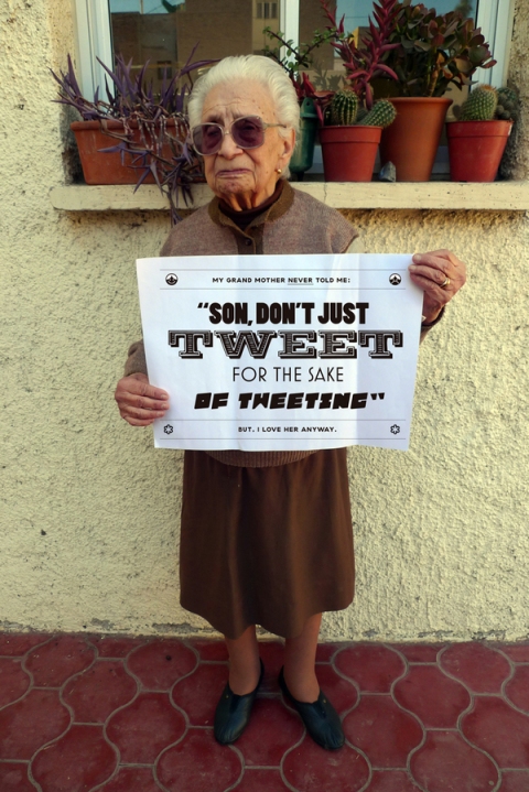
‘Just a few tips that my grandmother should have given me, but unfortunately never did’ by Chacho Puebla
KEI KOBAYASHI
July 26, 2011 § Leave a comment
pop.see.cul : Can you briefly describe yourself?
Hello, This is Kei Kobayashi. I am originally from Japan. I came to London to study abroad in 2006, and graduated from Central Saint Martins, BA Graphic Design course in 2010. After university, I started working as cutting assistant in Rob Ryan‘s studio.
pop.see.cul : Can you talk a little bit about your final major project at Central St Martins. What was your aim?
My final major project was a tribute to my childhood memories. The concept was ‘Nostalgia’. I created a toy, a paper puppet set, which was inspired by three books from my childhood. ‘The Three Bears’ by Tolstoy, ‘Birthday’ by Hans Fischer and ‘Caroline en Europe’, which my mum bought on their honeymoon in New Caledonia. When my mum went there, she found that book accidently. When she was a child, this book was also her favourite. When I was 3 years old, she gave it to me. The books prompted me to come over to Europe.
I was trying to make people touch the artwork using their five human senses. It is not always true that a person’s childhood toys go on to become their nostalgic treasures; but this was the case for a number of people I talked to, and it was the case for me. Some nostalgic treasures always stay with me in my daily life. Treasures take different forms for every person, however the toy, for me is capable of fulfilling many of the requirements of a treasure. And I hope that my paper puppet will be a treasure for someone in the future.
pop.see.cul : What is the first thing you remember about your childhood? Your best or worst memories perhaps.
When I was a child, my favourite moment was when my mum told me stories every night before I went to bed. I still remember the colours of each scene and phrase. My worst memory is the day when my cat passed away.
pop.see.cul : What inspires you the most?
Not only art and design but also a trips in Europe. For example, the view from an airplane or a beautiful sunset at the seaside.
pop.see.cul : What are your plans for the future? What is your dream?
I would like to be a designer who can create quality artwork that people want to keep for their whole lives, allowing it to become a treasure.
pop.see.cul : How would you describe your style in general?
I have always described my work as ‘hand made graphic design’. It’s really difficult to explain it, because I have not only did graphic design but also fashion and product design. But all of my work was handmade. Therefore, I love to use the term ‘hand made style’
DAVID DAVID
July 5, 2011 § Leave a comment
British print label David David, by David Saunders is quite inspiring and fun with geometric patterns and bright colours. Saunders usually prefers putting his prints on simple tees, but his umbrella and swimwear designs are as good as the t-shirts. Check out his blog. We loved the layout and imagery. If you check his studio and his inspirations; you’ll definitely understand the stories behind the prints.

ABSTRACT POETRY
June 3, 2011 § Leave a comment
This year the streets of various European capitals have been adorned with phrases such as CIVILISATIONS COME AND GO LIKE AUTUMN RAIN and WHENEVER YOU SEE THE SUN REFLECTED IN THE WINDOW OF A BUILDING IT IS AN ANGEL due to Robert Montgomery‘s continuing efforts to engage passers-by with his emotionally-charged and often melancholic abstract poetry.
ODD WORLD
June 1, 2011 § Leave a comment
Matthew Burne is a London based illustrator that has recently graduated from the BA Graphic Design course at Central Saint Martins. His interests and inspiration range from anything to everything. He feels that image making is his best skill in interpreting and understanding this odd world. Matt is flexible in his approach in creating new and interesting images.
YOU KNOW, THAT KIND OF STUFF
April 28, 2011 § Leave a comment
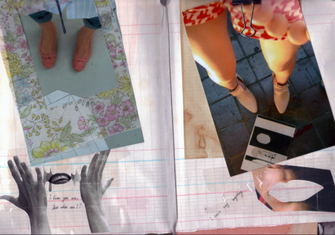
Most inspiring artworks and collages we have recently seen. Do you know that feeling, when you see a piece of art work that you immediately fall in love with; it pulls you in, makes you smile or makes you stare at it for a while and you try to figure out why you like it so much but at the same time it makes you angry and jealous because you feel talentless and inadequate when you look at it? Well we get that feeling whenever we look at FROM BRAZIL, WITH LOVE‘s website. The collages and photographs are very strong, carefully put together but they also look loose and carelessly done, as if all those photographs came together by coincidence and created a whole new story within themselves. Have a look!

“You’re a young girl, you should be at home. You should be dressed up, going out with boys, going to school, you know, that kind of stuff” Taxi Driver (1976)


BY ROMEU SILVEIRA – FROM BRAZIL WITH LOVE
All collages copyright from Brazil, With Love and respective artists and photographers.
http://frombrazilwithlove.thepop.com/
‘REMAGINING’ THE WORLD
April 27, 2011 § Leave a comment
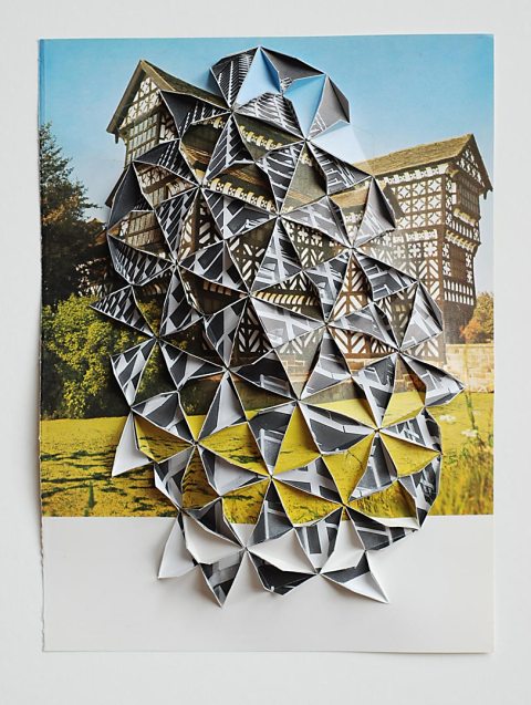
Abigail Reynolds might be seen as a contemporary artist, a modern painter, a graphic designer or even a story teller. It’s difficult to label things nowadays, but who cares about that. She lives in London, graduated from Goldsmiths College and Chelsea College of Art, took part in more than 30 exhibitions around the world. Above all, she has something new to offer. She takes the art of cutting paper to whole new levels, forming geometry, shape and inter-dimensionality. Mixing old and new imagery in a new perspective; such a simple idea but a highly interesting concept.



http://www.abigailreynolds.com/
Check out other artists who also a similar technic: Bovey Lee, Peter Callesen, Chris Natrop.
PUT ON YOUR GOD
April 19, 2011 § Leave a comment
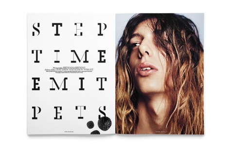
PARIS,LA is an independent bi-annual magazine based in Paris and edited in English. ‘The editorial line aims to establish a transversal & creative path between the two cities, and by extension between France & USA. PARIS, LA covers contemporary culture content in direct connection with fashion, art, writing, photography, music, and cinema.’
Unfortunately, we haven’t been able to buy an issue YET. But you can read it online ( yes we know..it’s not the same as actually holding the magazine in your hands and going through the pages, but better than nothing..right? )
The Issue number 4 silkscreen posters are so dreamy, so beautiful. ‘PUT ON YOUR GOD’ is a poem written by writer Ariana Reines. We couldn’t find her poem on the web but contacted her and hopefully we’ll get a reply and post it here. Her poem has become a series of 10 posters, in collaboration with Yves Saint-Laurent and Paris-La.
THE LOST AND FOUND MANIFESTO, a tribute to the YSL woman by Ariana Reines.
Click on the poster to see all of them.
Some of the pages of the magazine (issue number 4)
OVER THE RAINBOW
April 18, 2011 § Leave a comment
 The almost blinding colour combinations of S/S 2011 are by far the coolest trend nowadays. Tricky, as it may be, it’s back and it looks like we’ll be seeing more and more of it during the summer. All the blacks and neutrals were getting a bit boring anyway. NOT. They’ll always have their special place in our hearts and wardrobes, but change is always good. Colour is always good, so you better get ready to brighten up! Don’t play it safe, when it comes to colour, the brighter, the better!
What is colour blocking?
‘Traditionally, Colour Blocking is when two or more opposing or contrasting blocks of colour are combined in an outfit where they complement each other.’
The only 85 colours you’ll need this season
Wallpaper magazine chose their favourite colours from the catwalks and came up with this masterpiece, with the help of illustrator Andy Gilmore. So here are the colours you need for this summer. Not many! (http://www.wallpaper.com/fashion)
Pelin Yasar 2010:

GUILTY PLEASURES
April 18, 2011 § Leave a comment
As my thesis project for Central Saint Martins,I chose to make a video and a book in the theme of Guilty Pleasures. I decided to ask people in the streets what their Guilty Pleasures were. It’s such a good experience to just go out and talk to strangers, asking them to share a bit of their private lives! You meet all kinds of people, talk to them, learn about them. The video was shot in London, Brick Lane over the course of a few days.
The book is french fold binding because guilty pleasures are supposed to be hidden.
At first you have the impression that it is a simple white book with a little bit of writing and with nothing to discover. But then, you realise that you can find out more when you look through the pages.
I chose to have the book in white because it makes me think of purity, cleanliness, and innocence. But when you look at the book from the top you can see all these different colors that represent the different personalities.It shows that everyone has secrets.








 Images taken by


